

6 Examples of Bad Website Design
06/11/2024
Your website is often the first impression your users receive of your brand, products or services, and it is therefore crucial that you avoid the common design mistakes that regularly annoy users. A good website design prioritises user experience by making information clear, visually appealing and easy to navigate. On the other hand, bad website design does the opposite, making it difficult for users to achieve their goals, navigate pages and understand content. Below, we have explored 6 common examples of bad website design and the mistakes to avoid, ensuring your website is user-friendly.
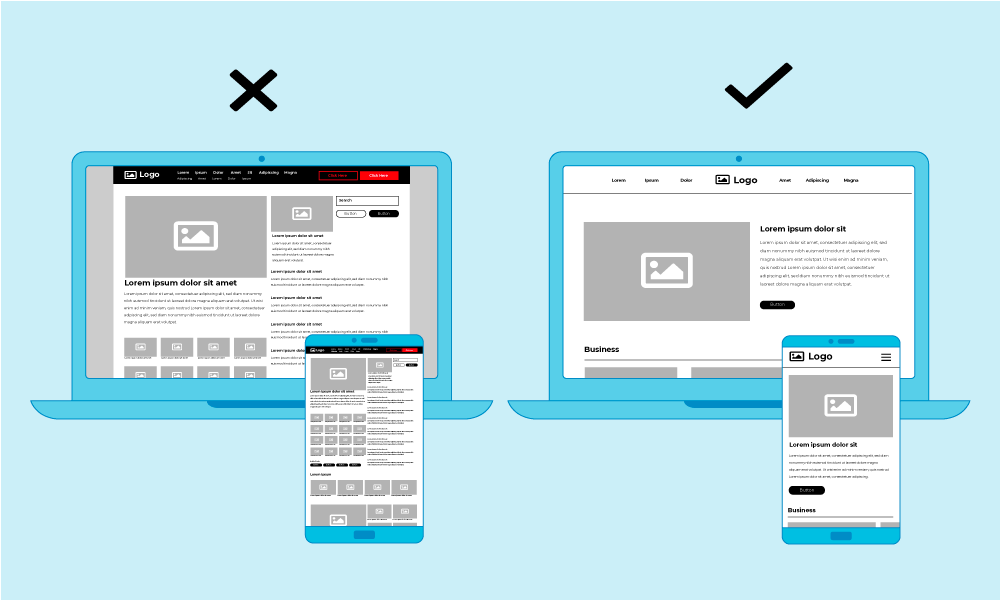
1. Non-responsive design

With more and more users accessing websites with their mobiles, having a non-responsive website has become one of the biggest mistakes a business can make. A responsive website will adapt to different screen sizes, making the experience equally seamless whether someone is on desktop, tablet or phone. Whereas a non-responsive website will require a user to awkwardly pinch, zoom and scroll around a page in order to navigate a site, this can lead to huge amounts of frustration, often leading to high bounce rates.
2. Poor Navigation
Easy to use navigation is essential if users are to find the information they're seeking, and perform the tasks they want to achieve with your website. Examples of poor navigation can include over complicated menus with excessive numbers of sub-categories, or hidden menus with vague labels. Instead, implement straightforward menus, using a logical and well-organised structure, this will ensure the navigation is easily accessible for all users. Don't re-invent the wheel, users have established expectations based on their experiences with other sites, so following best practices will make your navigation feel intuitive and easy to use.
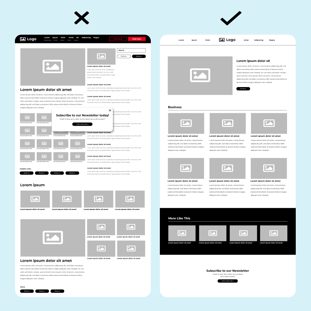
3. Cluttered Layouts

A cluttered layout could mean a page with too many images, text, pop-ups, colours and typefaces all on one page. This style of design creates visual chaos and overloads your users with irrelevant information instead of helping them focus on what is important. Instead, following a minimalist approach, and strategically placing content to give it enough white space is a great way of prioritising the important information and seamlessly guiding users through your content. Organisation of content is key, and using a clear hierarchy with headings, images and call-to-actions allow all components to work in harmony instead of competing for attention.
4. Stylistic Inconsistency
A website that lacks a consistent style will create a disjointed and unprofessional overall look and feel. A cohesive visual identity will use the same fonts, colours and design elements throughout a website. Without this consistency, your website may come across as unreliable, causing users to feel disoriented or even question if they've accidentally navigated to a different site. Establishing a clear style guide and ensuring all pages follow a unified layout will create a polished appearance that improves user recognition and ease of use.
5. Slow Loading Speed

Users are extremely impatient and are unwilling to spend more than a few seconds waiting for a website to load. Usability expert, Steve Krug, aptly states; "Web users tend to act like sharks. They have to keep moving, or they’ll die". If your website takes too long to load, users will likely abandon it for a faster option before the content even has a chance to load. Slow speeds are also a ranking factor for search engines, meaning that a slow site can hurt your search visibility. To improve load speed, enable browser caching and avoid using large file sizes, unoptimised code, and too many ads.
6. Lack of clear CTAs
Call to Actions help guide users to relevant pages and information. Without clear CTAs, users may struggle to understand what action they should take next. This could be signing up for a newsletter, purchasing a product, or contacting customer services. If your website lacks CTAs, their messaging is vague, or they are hard to find, this may result in missed opportunities to convert users and build effective user journeys. Instead, place CTAs strategically, on key pages when users are making important decisions. Clear, action-orientated messaging is also important, try words like "Shop Now", "Contact Us", "Get Started".
If you’re interesting in optimising the design of your website get in touch today to see how we could help you.
