

Website Design Trends for 2023
21/12/2022
As advancements in technology continue to emerge, so do new web design trends. This can make it difficult to know exactly what the latest innovations are. Luckily, there are some things that will never go out of fashion in web design like user-friendly layouts and clear navigation, these things are crucial for any website in any sector to have. Nevertheless, keeping up with the latest trends in web design is a great way to keep your website modern and fresh. So, we have made a list of the web design trends we have already started to see this year and that we think you should pay attention to in 2023.
Extended Reality
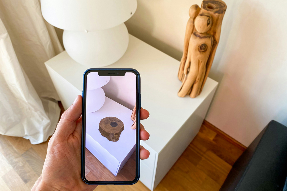
 Extended reality, or ER, refers to web design that incorporates augmented reality and virtual reality technology. The impact of web design today reaches beyond the screen, and ER is becoming increasingly popular – particularly in e-commerce sectors. According to Shopify, brands using augmented reality saw retail conversion rates increase by around 250%. Companies like Meta are also devoting huge amounts of resources into developing virtual reality technology, and are pushing for immersion to be a vital part of the next stage of the internet. While ER may not be suited to all businesses, ER can be a powerful tool for the user and be very helpful in making crucial buying decisions.
Non-traditional scrolling
More and more websites are experimenting with scrolling techniques to create unique and immersive user experiences. Horizontal scrolling, parallax scrolling and 'scrollytelling' are three methods of non-traditional scrolling becoming increasingly popular. While horizontal scrolling has its limitations when used as a primary form of navigation, it can be effective for websites with large volumes of visual content. Additionally, parallax scrolling is another trend that seems to be gaining popularity. It’s a great way to create a more immersive experience, as it adds visual depth to a website design by creating a more 3D experience. Finally, ‘scrollytelling’, a format becoming very popular for ‘about us’, ‘our story’ pages and even homepages. This technique uses a linear design with a set of sequences, text and animations that are triggered as a user scrolls.
Dark Mode
 While it is not new, dark modes or low-light interfaces are becoming widely adopted in web design. Although it is expected for white space to maintain its popularity, you can expect to see more and more sites starting to use dark mode and dark colour schemes over the coming years. Similarly, providing the user with a dark/light switch is also a trend we are likely to see more of. This may be partly because there are many practical benefits of dark mode, for example it reduces eye strain and improves attention and focus. Dark mode can also save battery power on devices, even at 100% brightness.
Video
Video, in particular autoplay videos, have always been a controversial website design element. It’s undeniable that when you first land on a website, an autoplay flashy video that blares sound out of your computer speakers is annoying and might even cause you to click off. However, there has been a rise in the number of websites now using video content in more subtle and engaging ways. Using video, in particular silent videos on hero banners and homepages, can be eye-catching but not intrusive and a great way to present your brand if executed appropriately. A website's stay time (how much time a user stays on a page while looking at it) is also likely to increase with engaging video content.
3D content
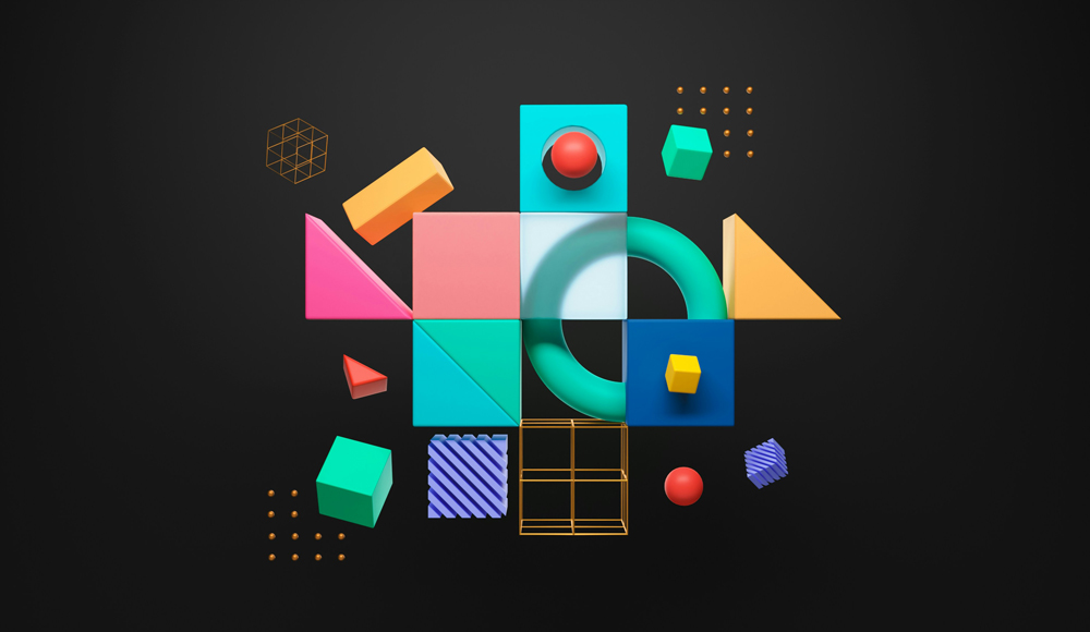
 Incorporating 3D visuals into web design isn’t a completely new trend, we have seen buttons, logos and many other elements use some form of shadows or layers to illustrate a 3D effect for a long time. However, thanks to developing web technology 3D visuals have come a long way, and it is now possible to incorporate some pretty incredible 3D animations and interactive graphics into website designs. This goes hand-in-hand with the development of ER experiences for users, as 3D elements can provide much more than just a visually exciting component.
Animation
Micro-animation (small animations) added to the interface of your site can be helpful in guiding your users through your website. These elements can add playfulness and depth, as even the most subtle movements can bring your site to life. They can also emphasise important areas of your page and direct your user's attention accordingly. Animated GIFs are also becoming increasingly popular to engage users and add a unique design element to your page. While micro-animations have been growing in popularity for a while, we will likely see websites finding ways to use them more organically in sites and products next year.
Gradients
 Didn't you hear? The 90s are making a comeback! Across many design disciplines, we are seeing influences from this decade everywhere. Gradients were popular in design in the 90s and now appear across social media, design and fashion. Gradients add colour, energy and vibrancy to website designs, but they can also add depth and texture. As gradients are a long-term trend, we are excited to see how they continue to evolve in 2023.
