

What is White Space, and Why is it Important?
02/08/2024
What is White Space?
White space, sometimes known as negative space, is the area of empty space that surrounds the different elements of a design. It is also the space within individual design elements, like the space between individual letters or lines of text – although this is also called ‘kerning’ or ‘tracking’.
Unlike the name suggests, white space does not have to be white. It can be plain, coloured or even patterned, it just has to be empty. White space is one of the most important aspects of a design as it helps to balance design elements, and organise content. This means users are less likely to feel bombarded and overwhelmed while looking at your website.
What are the Different Types of White Space?
There are 2 main types of white space that are used in different situations based on the relationship different elements have to each other.
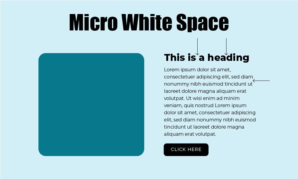
Micro White Space

The smaller spaces between design features, such as letters, text lines, paragraphs, images and icons is called micro white space. This often has a direct impact on the legibility of your content. For example, if there wasn't a space between letters or new words, then all text would just be a continuous stream of letters. Or when websites have a gallery page, there is usually a small gap between different images, so they are separated, and it isn't one large confusing collage.
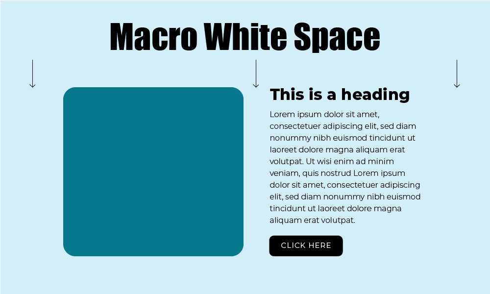
Macro White Space

Macro white space, on the other hand, is the larger space between the major elements in the design and is used to structure the overall design layout. Examples of macro space are the larger spaces between content blocks, and the space on the left and right of the content found on most websites. Rather than being used to improve readability, macro white space is used to add structure to a design and chunk information into sections. Google provides one of the best examples of macro space. It has one main function, to allow users to search, and this feature sits in the centre of the page surrounded by lots of white space, there are minimal distractions and the users' attention is focused on the search bar.
Why is White Space Important?

Legibility
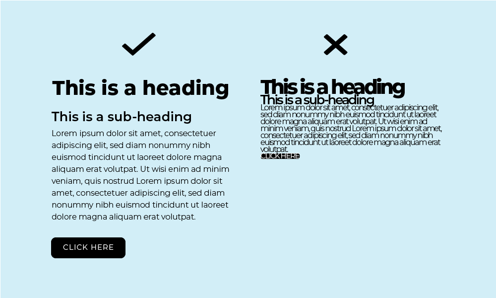
White space is essential in ensuring text is legible. See the example graphic, this demonstrates the huge difference white space has on text. Both paragraphs are the same, but the first effectively utilises white space, while the second doesn't and is therefore almost completely illegible, you would have to work very hard to read this.
Hierarchy
The graphic above also depicts how white space can illustrate or emphasis the hierarchy of different elements on a webpage. The top heading is the most important and therefore has the most space surrounding it, so it stands out. The subheading is still important, but it has less white space surrounding it and sits closer to the paragraph below it, this helps to indicate the subheading is closely related to the paragraph. Clever uses of white space like this allow users eyes to seamlessly travel through your content, their attention can be focused on the important information and flow from headings, to paragraphs, to buttons and images.
Harmony
Poor use of white space will make content disharmonious and distracting. Webpages are easier to follow when the layout is balanced and there are consistent and repeated uses of white space. This will create an overall sense of calmness, clarity and order to your website content.
Branding

While white space is mainly a technique for improving the layout of content and making a user's experience better, it can also have a big impact on a brand's tone. As a general, the more high-end a brand or product is, the more white space they have on their website. Take, for example, Porsche's homepage. There is an abundance of white space, minimal text and very few buttons, the user's attention is totally focused on the product. The lack of distraction also makes the product and overall brand feel luxurious, exclusive and important.
